Hi everyone! Today I have the SquareHue January 2015 box to share on the blog, complete with swatches, color comparisons, and some nail art! This year, SquareHue is going with a “decades” theme, with each month’s colors representing a decade from the 1900s to the 2010s, and I’m pretty excited for the whole thing. The colors I’ve gotten from SquareHue in the past two months have really inspired me in terms of nail art; it’s a fun challenge for me to take the colors and figure out a good way to combine them, especially since they’re totally random. Given my excitement about the upcoming SquareHue Decades Collection, I’ve decided to continue with them for the indefinite future, and my SquareHue box will be a monthly installment on the blog.
January’s box was inspired by the 1900s and contains some really lovely polishes. Unlike the previous two months’ boxes, which contained some rather offbeat colors, this collection is rather conservative and demure in terms of both colors and finishes. Although I initially subscribed to SquareHue for their unconventionality, I absolutely adore the toned-down elegance of this bunch of polishes, and I’m really happy with this box. With the 1900s as the theme of the collection, I used the three polishes to create some classic-looking floral nail art – inspired by Robin Moses – that reminds me of flowery Victorian era patterns.
 Here’s an unboxing photo! SquareHue changed its little card so that you can swatch the colors on it as a reference. This isn’t a very useful feature for me, since I never look at these cards again, but it’s nice. If you look on the card, all three colors are labeled as cremes, but it’s very clear that two of them are mislabeled (they’re actually shimmers). Strange…

First Flight is a light gray shimmer that leans a bit frosty. Color-wise, it leans ever so slightly to the warm side of gray, which means that it looks decent against my skintone (most gray polishes don’t, especially not light grays). In terms of formula, the polish has a few issues, but is reasonable overall. On the plus side, the consistency is perfect and the polish gets to full opacity in two coats. On the minus side, the frosty shimmer makes it somewhat challenging to avoid brushstrokes, and I also had some issues with patchiness near my cuticles that needed some smoothing-out. I ended up liking this polish a lot; considering that it’s gray, that’s saying something.


Given my distaste for most gray polishes, I don’t have a good comparison for First Flight. Zoya Harley might be a dupe or at least similar, but I don’t have it. All the same, just to show you the difference between this polish and a cooler gray, I did compare SquareHue First Flight to Julep Bergen. While they’re clearly different in color, these two polishes are kind of similar in lightness and their amount of shimmer.

Gibson Girl is a light-medium pink creme polish, and my surprise favorite of the collection. Somehow Gibson Girl hits that “just right” place that makes me love it – not too cool or warm, not too bright or muted – and I’m super happy that it came in the box. This particular shade of pink sits somewhere between rosy pink and peachy pink, and has the perfect amount of dustiness to look feminine and pretty without getting too girly for my personal tastes. It’s very flattering with my skintone, and I’ll probably wear this polish by itself sometime when I have to be conservative with my nails. The formula of Gibson Girl is also quite nice; it has a good consistency, and it’s easy to get to opacity in two coats provided that the first coat isn’t very streaky.


When I swatched SquareHue Gibson Girl, I couldn’t find a dupe for it among my many pinks. However, after I removed my swatch (of course), I found that Julep Edith does have a similar base color to Gibson Girl, and might be good to compare to Gibson Girl. In a few days, I’ll edit this post to show what they look like side-by-side.
Victorian End 1909 is a medium-dark, slightly warm purple shimmer. Overall, the polish comes across as a plum purple, but the base color is actually quite gray and “dusty”; I think this dustiness makes it interesting and elegant. Like the other two polishes in the box, this one has a good formula and covers nicely in two coats. I did have a little bit of patchiness near my cuticles, but nothing unreasonable.


I thought Julep Patricia might be a a dupe for SquareHue Victorian End 1909, but it’s not. Julep Patricia has a blackened base, and is substantially darker overall. Just for fun, I stuck in SquareHue Vaclavske Namesti from the November 2014 box to show how different they are. Vaclavske Namesti is redder and has a silvery shimmer, rather than the purple shimmer in Victorian End 1909.

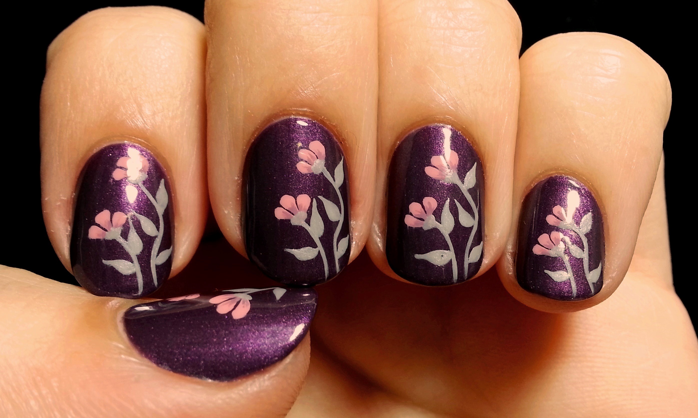
When I looked at the colors all together, I thought they were just so elegant and floral that I decided to paint some delicate flowers on my nails using the collection. After browsing a bit online for ideas, I found one by Robin Moses on YouTube called “DIY Black with Pink Flower Nail Art” that looked like what I wanted to do. She originally did just an accent nail, but I wanted to put the pattern on all my nails.

Since the video shows the technique better than I can, I’ll be minimal with my description. I started by painting all my nails with base coat and two coats of Victorian End 1909 (purple). Then I took a narrow striping brush and made the flower stems using First Flight (gray), followed by the leaves. I used Gibson Girl (pink) to make the three flower petals, which I shaded at the bottom using a mix of the purple and pink polishes. Finally, I put a small dab of the gray polish to give the flower a little receptacle. And done!


The end result is so cute! I’m really pleased with how these nails turned out. The flowers look so delicate and feminine.
Well, this SquareHue box was definitely a hit with me! Now I’m really stoked to see what they’ve got for the rest of the year! I hope you’ve liked my post 🙂 Thanks for reading!
– Emi

I couldnt paint my nails to save my life! I’m only capable of painting my nails with clear polish…
LikeLike
With painting nails, practice makes perfect! I definitely got better with time. You could try a sheer pink polish as a step up from clear (L’Oreal Wishful Pinking is my favorite), plus you can try cuticle clean up, like in this tutorial: http://the-polished-perfectionist.blogspot.com/2011/03/how-to-clean-up-after-polishing-your.html .
LikeLike
This is stunning! Your flowers are perfect! I love all three colours particularly the grey shimmer!
LikeLike
Thanks so much! Yeah, I really liked all three colors too; this was a great box 🙂
LikeLike
Those colors are very pretty, and the nail art, too!
I’m sure you always do base coats, but if you do an Edith comparison make double-sure you do. I love the color, but it’s the only Julep polish I’ve found that stains. (A swipe of polish remover slightly brings out the golden flecks in it.) And if you like dusky purples, try Julep Reece. Not very close to this, but one of my faves.
LikeLike
Thanks so much 🙂
I do use a base coat when swatching, but thanks for the warning about Edith! I’ll definitely try the tip to bring out the gold flecks with the remover. In the past I’ve gotten staining with some other Julep colors though; Lissa in particular was quite the stainer!
Julep Reece looks amazing! I’m going to have to try it sometime!
LikeLike